I am the photographer, Takashi Yasui. My first encounter with Lightroom was back in 2013. At that time, it wasn't the subscription-based model we see today but was a one-time purchase software called "Adobe Photoshop Lightroom 4". Checking my purchase email, the price was 12,800 yen. Back then, I wasn't a professional or anything, so spending that amount on software was quite a big decision for me.
Before long, it became an indispensable partner in my photography endeavors. For the subsequent 10 years, there hasn't been a day when I didn't launch Lightroom, showing just how extensively I've used it.
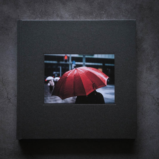
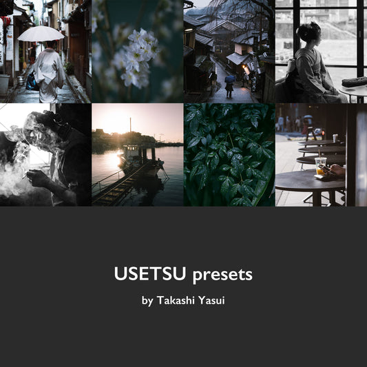
In 2023, I published a comprehensive photo book titled "PERSONAL WORK." I confronted and selected from approximately 150,000 past photos, re-edited them, and engaged in intense discussions with the printing director about color corrections and other aspects. Throughout the process of completing the photo book, I faced the colors of my photographs more than ever before. Considering this as a milestone, I am now offering my original Lightroom presets, "USETSU presets," for sale.

Before - After
No need to purchase Lightroom presets
Honestly, I believe that purchasing Lightroom presets isn't necessary. Firstly, even if you buy a creator's preset, your photos remain uniquely yours; they won't magically transform to look exactly like the creator's samples. Moreover, the presets might not always align perfectly due to differences in camera brands, which introduces an element of uncertainty.
I've personally bought several creator presets and found that they didn't always deliver the effects I was hoping for.
However, considering that this article is about selling presets, let's delve into the advantages of purchasing them. One of the main benefits is that you get insights from a creator's extensive "photo editing deep learning" process. In my case, it's a culmination of 10 years of editing approximately 150,000 photos, which is distilled into the "USETSU presets."
So, for those who are new to Lightroom or those who haven't been fully satisfied with their presets, this could be an excellent shortcut or a source of inspiration.
For professionals like me, who rely on photography for a living and regularly need to deliver hundreds of shots, the goal isn't to perfect a single photo but to elevate hundreds of photos to a consistent 85% of their potential. These presets are designed with this in mind, aiming to find a common ground from the start. Whether you use the preset as it is or as a base to customize your unique color palette, it offers flexibility in its application.

Before - After
Regarding the compatibility differences between camera manufacturers, while creating the "USETSU presets," I sought the collaboration of several creators and tested the presets with RAW files from various brands. While I've designed them to be reasonably compatible across different manufacturers, it should be noted that I personally use a FUJIFILM camera, so naturally, the presets mesh exceptionally well with FUJIFILM.
Before diving into the specifics of the "USETSU presets," there are a few key points I'd like to highlight:
The Importance of RAW Processing
In Lightroom, you develop using RAW files. There are primarily two reasons for this. First, compared to JPEG, RAW files contain a wealth of information that can be leveraged during the development process.
Secondly, the choice of profiles available for RAW files is vastly superior.

You can choose the profile from the indicated arrow section.
Profiles, much like presets, act as a kind of filter. Unlike presets, which alter editing parameters, profiles don't change these parameters (though some profiles allow you to choose the amount applied).
Since profiles don't adjust the editing parameters, you can think of them as a base or foundation for your edits. While you can make changes later, it's generally a good idea to view profiles as your starting point in the editing process.
Compared to JPEGs, RAW files offer a broader range of profile choices. By selecting "Camera Matching" from the dropdown, you can also choose profiles provided by various camera manufacturers. Camera Matching isn't available for JPEGs, which means that they've already had a profile applied.
For the USETSU presets, "Adobe Standard" is set as the default. Since I use a FUJIFILM camera, I usually toggle between "Pro Neg Std" and "PROVIA/Standard" from the Camera Matching options.

The choice of profile can change the color tone and contrast of the image.
This profile selection, along with the degree to which it's applied, can add a unique character to your photos. Since profiles don't adjust the editing parameters, there are occasional cases where an unintended profile might be selected, so be cautious.
Understanding the role of each editing parameter: While I won't delve deeply into each parameter here, it's essential to understand that they all have interrelated roles. It's beneficial to visualize the role of each parameter, imagining their effects while looking at actual photographs.

RAW with the profile set to "Adobe Standard."
First and foremost, the most crucial parameter is undoubtedly the "Basic Adjustments." This parameter will require fine-tuning from start to finish. If the exposure or white balance isn't accurate, no matter how much you adjust the other parameters, there's a high chance of getting lost.
The next essential parameter is the "Tone Curve." Here, you adjust finer contrasts and colors. Specifically, this refers to the point curve, and even a slight bend in the curve can significantly alter the image. It's akin to the accelerator in a car.

Adjusting the Tone Curve, I'm going bold to amplify the contrast here.
Think of it like stepping on the accelerator.
Once you hit the gas with the Tone Curve, you'll tap the brakes with the "HSL" (Hue, Saturation, Luminance). Adjusting each color, you'll find the right balance and pace. The Basic Adjustments also act as brakes in this phase.

Adjusting the HSL and Basic settings,
I'm carefully balancing the shadows and highlights, along with the color tones.
Think of this as applying the brakes.
In essence, it's like driving a car where you smoothly alternate between the accelerator (Tone Curve) and the brakes (HSL & Basic Adjustments). This interplay, to me, encapsulates the editing process in Lightroom.
Once you get the hang of it, you can add a unique touch using "Color Grading". Considering complementary color relationships, you'll refine the image to really make it your own.

Color Grading. Pay attention to the color of the asphalt,
and you'll notice the effective touch of amber that's been introduced.
"Details" and "Calibration" also play pivotal roles in fine-tuning the final image. Personally, I prefer photos with reduced peripheral light, but this is a matter of individual preference.

Before - After
Keeping the above points in mind, you might feel empowered to create your own original presets without the need to purchase any. It then becomes a matter of increasing the number of edits and finding the optimal solutions for your work.
Now, for those still interested in "USETSU presets", please proceed to the details below.

Overview: "USETSU presets" by Takashi Yasui
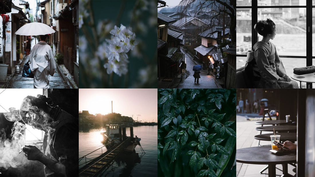
This collection includes a total of 10 presets.
There are 5 types: 侘び Wabi", "寂び Sabi", "しおり Shiori", "細み Hosomi", and "軽み Karumi", each consisting of a Side-A and a Side-B configuration.
- "Wabi" ... Suitable for street and nature photography
- "Sabi" ... Monochrome
- "Shiori" ... Ideal for portraits
In contrast to these classic presets,
- "Hosomi"
- "Karumi"
are presets that offer a cinematic feel.
【侘び】
01 WABI-A
This preset is the crown jewel of the collection. I aimed to create an ideal preset that stands the test of time and isn't swayed by trends.
The delicately adjusted contrast is inspired by the world of "In Praise of Shadows" (a famous essay on Japanese aesthetics by Junichiro Tanizaki). The shadows are reduced to the brink of maintaining details, while the infused amber tone imparts warmth. Introducing a complementary royal blue from the mid-tones to the highlights creates color contrast, adding depth throughout the photograph.

02 WABI-B
"WABI-A" comes with an alternate version that offers a distinct personality. While it retains the contrast of "In Praise of Shadows", this preset applies a color grading of cyan-blue tones throughout. It gives a cool impression and pairs well with scenes like a lakeside morning, rain-soaked alleys, or backlighting during sunset. If you find it too blue, you can adjust using the white balance.
All the presets in this collection are set to the "Adobe Standard" profile. However, switching to "Adobe Color" when needed can add depth to the colors and contrast.

【寂び】
03 SABI-A
The theme for this collection is "Timeless", which naturally necessitated the inclusion of a monochrome preset. In this preset, I've focused on achieving a refined contrast and grainy texture, aiming to capture the beauty of serenity and simplicity. The charm of a photo, which might not be immediately visible in color, can be rediscovered in black and white, an experience that can be described as quintessentially photographic.

04 SABI-B
This version has reduced contrast compared to "SABI-A" and can also be used for portraits. In such cases, it's recommended to increase the orange in "Black & White Mix", which brightens the skin tone. It pairs well with backlit city photos, resulting in an evenly toned, gentle impression of black and white photography.

【しおり】
05 SHIORI-A
"Shiori" is a preset that pairs well with natural light portraits. Initially, I infused the shadows with amber similar to "WABI-A", but considering its compatibility with skin tones, I opted for green. This gave the photos a more refined finish. For skin colors, please adjust as needed using masks or the red and orange in HSL. This preset is recommended not just for portraits of people, but also for animal photography.

06 SHIORI-B
"SHIORI-A" is a different character variant of the original. The contrast has been optimized for portraits. By adding cyan-blue through the tone curve and color grading, it yields a cool-toned portrait. It effectively removes any excess yellow from the frame, often making it a perfect match for product photography at first try. As with the other presets, please adjust skin tones as needed using masks or the red and orange in HSL.

【細み】
07 HOSOMI-A
A preset that evolved from "WABI." Even so, its faint shadows are so distinct that it retains little of its original form, emphasizing a sense of deep mystery and fleetingness. It pairs well with portraits on cloudy days or indoor shots, but it suits a variety of photos surprisingly well, giving it quite a broad applicability.

08 HOSOMI-B
A variant with a different character from "HOSOMI-A." This version emphasizes the blue tones more, yet it's still highly versatile. The broad applicability of "Hosomi" might be attributed to its subdued photographic assertiveness, leaning towards a cinematic impression. There's a profound feeling, as if you're viewing the photo through a screen.

【軽み】
09 KARUMI-A
A preset evolved from "Hosomi." We swung back from a cinematic expression to a photographic one. By journeying through "Hosomi" once, we managed to give an impression that some part of the photo seems about to move. We kept the shadows subtle and infused the image with complementary amber and royal blue tones.

10 KARUMI-B
A variant of "KARUMI-A." This one features prominent cyan in the shadows. Intentionally aiming for a teal & orange look can also be intriguing. It pairs well with street photography. It offers a more cinematic feel than "Wabi," yet more photographic than "Hosomi," making it ideal for photo set.

Other Announcements
"USETSU presets" are updated based on the following checklist items. When updating the presets on your own, please make sure to tick the appropriate boxes accordingly.

"USETSU presets" package includes 10 presets, with the added bonus of two additional presets named "+Reset" and "+Natural". As the name suggests, "+Reset" serves as a reset function.
"+Natural", on the other hand, is a preset that limits adjustments primarily to basic contrast and color tuning. In commercial photography, there are instances where extensive photo editing isn't necessary, and having such a versatile preset can be quite handy.

Before - After
USETSU presets FAQ
Can I use the USETSU presets for commercial photo editing?
Absolutely. They were created with professional use in mind.
Can the preset be used on mobile devices?
Yes, the package includes DNG files that can be installed on mobile as well.
How do I download the presets?
After your order, you will receive an email with a URL to access the content. You can also access it from the "Access Digital Content" button on the order screen.
How do I install the presets in Lightroom?
Can I return or get a refund?
No returns or refunds will be made after an order has been placed.
Is the 20% discount on the presets only for new concurrent purchases?
If you have previously purchased a photo book from the official website, enter the coupon code "P601NAJWDA11" on the checkout page to receive a 20% discount.
The coupon code isn't working.
To apply the coupon code, you need to log in under the same conditions as when you purchased the photo book "PERSONAL WORK". Please check your email address.
I bought the presets. Will I get a 20% discount if I buy the photo book at a later date?
The 20% off is only a preset discount; the photo book is not eligible for the discount. Please consider purchasing at the same time.
Can I sell USETSU presets with modifications or as is?
No, you can't.
You can purchase the presets here.